
In the previous articles we saw why collecting customer feedback matters, how to design a useful form and how to use AI to translate and classify open responses.
Now the final step is missing: turning all that work into a dashboard that can be reviewed periodically and helps you make decisions.
Because one thing is having responses in a spreadsheet, and quite another is having a system to see what is happening, detect patterns and decide what is worth changing at business or UX level.
This is the fourth article in a series about how to turn customer feedback into useful data for making decisions.
The series has four parts:
- Why collecting customer feedback is essential.
- How to create a useful feedback form.
- How to use AI to translate and classify open responses.
- How to turn that feedback into dashboards and a monthly tracking routine.
By the way, in this article I am going to talk about Data Studio. If you know it as Looker Studio, it is the same tool: Google recovered the Data Studio name after having used the Looker Studio brand for a while.
That is why, from here on, I will use Data Studio so as not to mix names.
Índice de Contenidos del Artículo
- Why you need a feedback dashboard
- What data are we going to visualise
- Step-by-step guide to creating the feedback dashboard
- Step 1: think about the KPIs you are going to review month by month
- Step 2: choose the format of each chart
- Step 3: define the overall dashboard design
- Step 4: create the panel in Data Studio
- Step 5: choose the Google Sheets data source for the general KPIs
- Step 6: add the AI-enriched data source
- Step 7: build the dashboard and decide whether to compare with the previous period
- Step 8: define feedback governance
- Common mistakes when creating feedback dashboards
- Final checklist
- Closing the series: from feedback to continuous improvement
- Frequently asked questions
- What is a customer feedback dashboard for?
- What data should a feedback dashboard show?
- How many KPIs should the dashboard have?
- What tool can I use to create the dashboard?
- What data sources does the dashboard need?
- Is it worth comparing the data with the previous month?
- How often should I review the dashboard?
- Who should be responsible for the feedback dashboard?
- What mistakes should be avoided when creating a feedback dashboard?
- What is the difference between having a response sheet and having a dashboard?
Why you need a feedback dashboard
A feedback dashboard is used to turn loose responses into an ordered view of the business: how many people respond, what rating they leave, what problems appear, what topics are repeated, which countries or profiles concentrate more incidents and which comments are worth reviewing more carefully.
Used well, it gives us a clear development and testing roadmap.
In the example in this series we are focusing on feedback from a website or app: what has driven or blocked a conversion.
The same logic applies to any customer feedback form: product, service, support, training, delivery, satisfaction or post-sale experience.
The questions and KPIs will change, but not the core idea: moving from isolated responses to information that can be reviewed month by month.
If the feedback stays in Google Sheets, it depends too much on someone remembering to go in, filter, read, sort and draw conclusions. The dashboard reduces that friction and, although it does not decide for you — nor do I think it ever will — it does show the team what deserves attention.
What data are we going to visualise
In this case we have two main sources.
The first is the original form sheet.
That is where the responses arrive as they are: date, rating, ease of the process, decision reason, whether there were incidents, country, age, gender or whether the user requested a response.
The second is the AI-enriched sheet
This comes from the workflow in the previous article.
In it we add new fields: incident clusters, root-cause summary, comment tags, competitor mentions and comments translated into Spanish.
We will use both sources.
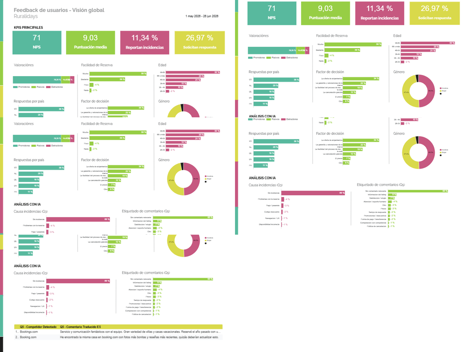
In the example dashboard, the main KPIs appear at the top, the closed responses are visualised in the body of the panel and the AI-enriched analysis appears at the bottom.
Step-by-step guide to creating the feedback dashboard
Before opening Data Studio, it is worth being clear about what we want to review, how we are going to visualise it and what design will make the panel easy to understand quickly.
In this guide I am not going to get into the click-by-click of each chart, because that depends a lot on the form and the available fields. The idea is to understand the general process to build a useful dashboard, not just a pretty one.
Step 1: think about the KPIs you are going to review month by month
The first thing is to decide which indicators are worth reviewing every month. And here it is worth being selective.
A feedback dashboard does not need twenty main cards. It needs a few well-chosen KPIs, ideally between 3 and 5.
In the example in the series we use indicators such as NPS or overall rating, average score, percentage of users who report incidents and percentage of users who request a response.
Those KPIs work because they summarise the general health of the feedback at a glance.
Below that you can have supporting charts, but the top section should answer a very simple question: how are we doing this month?
If you have never set up a form like this and are not sure which KPIs to choose, you can ask AI for help.
For example, you can give it the columns in your sheet and ask it to suggest useful indicators for reviewing conversion, support, product or service feedback.
That said, AI gives you ideas, but the final decision has to be yours. The important KPIs depend on the business, and you are the one who knows what decisions you want to make with this data.
Step 2: choose the format of each chart
Then it is time to think about which visualisation fits each data point. Not all questions are read in the same way.
An average score can work well as a main card.
A rating distribution may work better as a bar chart.
A question about the decision reason can work as horizontal bars, or even a pie chart if there are no more than three options (and even then, sometimes that circular chart does not work).
Countries can be shown in a table, map or bars.
Open-response categories are usually easier to understand as bars or tables, because we want to compare frequency and read labels clearly.
Again, at this point you can also rely on AI to generate a first proposal: which chart to use for each field, what metrics to calculate and which visualisations to avoid.
Step 3: define the overall dashboard design
Before building the panel, it is worth thinking through the complete design:
- What will go at the top: usually the most important thing.
- What will go in the centre: usually charts that help explain what is above.
- What will be left for the bottom: usually other types of data that are not so general.
- What titles each block and each chart will have: essential for it to be understood at a glance.
- How colours, logo and styles will be used: using brand colours, logo and a coherent look is usually a good idea, because it makes the dashboard feel like part of the company’s working system rather than a provisional report. But there is no fixed rule for every business, and the priority should always be that it reads well, that the charts are understood quickly and that the design does not compete with the data.
The example we use in this series works because it is simple:
- Main KPIs at the top.
- Easy-to-read charts.
- AI-enriched analysis at the bottom.
In another business there may be a better structure, but burn this into your brain: the important thing is that the dashboard can be understood at a glance.
If you have no experience designing dashboards, AI can also help you at this point.
You can ask it for a visual structure proposal: blocks, order, chart types, titles or colour criteria. Then you have to merge these proposals with the reality of the business and, in many cases, simplify.
Step 4: create the panel in Data Studio
When you already know what you want to measure and how you want to organise it, then it does make sense to open Data Studio and create the panel.
Data Studio is a very suitable tool for this type of dashboard for several reasons:
- It lets you connect Google Sheets (which is why we insisted on this tool in the steps explained in the previous articles).
- Create enough visualisations to review the feedback.
- The volume of data will not be a problem.
- And sharing the panel with the team easily will not be a problem either.
If your company already works with another BI tool, you can use it perfectly, but for a system based on forms, spreadsheets and monthly review, Data Studio fits very well, even, as I say, with fairly large volumes.
In fact, my recommendation for teams that have never worked on this before is to start with a simple page. There will be time to create more tabs, filters or specific views if the system grows.
The important thing at the beginning is that the panel answers the main questions without forcing you to investigate every month.
Step 5: choose the Google Sheets data source for the general KPIs
The first source will be the original form sheet in Google Sheets.
This sheet is useful for the general KPIs and for most closed responses:
- Number of responses.
- Average score.
- Ease of the process.
- Country.
- Age.
- Gender.
- Decision factor.
- Users reporting incidents.
- Users requesting a response.
The most important advice I can give you here is to review the field types carefully. If a score comes in as text, you cannot calculate averages correctly. If a date is not recognised as a date, the period filters will fail. This review is an unglamorous part, but a very important one.
Step 6: add the AI-enriched data source
The second source is the sheet we generated in the previous article with n8n and AI.
There we have fields added by the workflow:
- Incident cluster (classification by type).
- Translation of the incident text.
- General comment cluster.
- Translation of the comment text.
- Competitor detected (Booking, AirBnB…).
- AI processing date.
As you can see, this source is used for the charts we could not build with the original form alone: recurring topics, incident reasons, competitor mentions or analysis of open comments.
Step 7: build the dashboard and decide whether to compare with the previous period
When the sources are connected to Data Studio, it is time to build the dashboard with the defined blocks. In our example:
- Main KPIs.
- Bar charts with closed responses.
- AI classification of incidents and comments.
- Table of comments that mention competitors.
Here there is an important decision: whether or not to compare with the previous period.
At the beginning, or if you have few responses, comparing month against month can create more noise and false conclusions than anything else.
When the volume grows, it can be very useful to see whether the improvements applied are working.
It is also worth thinking carefully about filters: country, language, market, age, gender, period or type of incident. Not all of them will be necessary in every dashboard, but the right filters can help you move from a general reading to an actionable one.
Again, except for the time filter, which is useful from the start, I suggest you wait a while and get control of the dashboard before implementing the rest.
Step 8: define feedback governance
The dashboard does not end when it is published. Actually, that is where the important part begins.
And what is that?
Define the data review routine, to make decisions.
As a baseline, a monthly review is usually enough to detect patterns, review trends and decide improvements.
If recurring critical incidents appear, such as a payment problem, a specific booking error, a drop in trust or a sharp increase in negative comments, it may make sense to review it weekly until it is resolved.
Another important point for getting good results: there must be a responsible team. And just one, not several.
Although in this type of review CRO, Analytics and CRM profiles should take part, because they connect feedback, data, conversion and later activation, the team responsible for the dashboard and its maintenance has to be just one.
From there, each business should add to the follow-up meeting whoever makes sense:
- Marketing.
- IT (incidents).
- Customer Service (incident resolution or sales or retention arguments).
- Product.
- Operations.
- Management.
- Or any area that can act on what appears in the feedback.
The meeting should not be limited to looking at charts. The responsible team will contribute the most important thing:
- The context.
- The proposed roadmap.
- The points to discuss together.
The meeting should end with decisions: what has been detected, what is prioritised, who is responsible, what is changed and when it will be reviewed to see whether it has improved.
As I said earlier, this feedback will generate the development roadmap for the business or its digital products.
Common mistakes when creating feedback dashboards
As in previous articles, I will tell you the most frequent ones.
Creating charts before deciding the KPIs
It is tempting to start building cards and bars because Data Studio makes it easy, but if you do not know what you want to review, the dashboard becomes a puzzle that does not fit.
Or a pointless Frankenstein.
And with four legs and three arms.
This is what happens at the beginning and when several departments are leading. That is why one department must lead while listening to the ideas of the rest.
Adding too many charts
I have just mentioned it, but I will repeat it: if everything seems important, nothing is.
The dashboard has to help focus, not generate more noise.
Drawing conclusions with few responses
If you have very little volume, one or two responses can move a chart too much. In those cases you have to look at the data cautiously and not overreact.
And be careful about showing these overvalued data to the CEO or management, because they generally do not have the right context to interpret them and it can be harmful to the business, since they will inevitably modify a roadmap based on incorrect premises.
Watch the dates
When building the dashboard in Data Studio, depending on the chosen period, the charts may have more or fewer variables.
That is why, when preparing it, it is advisable to choose the widest period, so that the maximum number of possible values is shown, fit them in and then leave whatever period it is (generally, the previous month).
Creating the panel and not turning it into a work routine
Probably the most serious mistake.
Why?
Because you have invested time — this is not put together in a moment — and it is not serving any purpose.
A dashboard that nobody looks at is useless. One that is reviewed, discussed and ends in actions changes how a company understands its customers and improves, yes or yes, the whole business or part of it.
Final checklist
Before closing the article, let us review what you should have if you have followed all the steps:
- A dashboard connected to the feedback sheets.
- Some main KPIs to review month by month.
- Clear charts for closed responses.
- Visualisations of tagging for open data classified with AI.
- Translated comments or grouped when needed.
- Date filter. Perhaps also by country, language, market or profile.
- A monthly review routine.
- Defined owners to turn insights into actions.
That is no small thing, is it?
Closing the series: from feedback to continuous improvement
If there is one single idea I hope you have kept throughout the series, it is this:
Collecting feedback means listening better, organising what customers say and turning it into decisions.If the data does not reach a meeting, does not generate an action and is not reviewed afterwards, the system remains half-done.
The nice thing about this whole process is that each piece has a role:
- The form collects the customer’s assessment.
- The automated flow with n8n and AI helps organise the complicated part (open text).
- The dashboard lets you see the status and extract insights and analysis points.
- Governance turns those insights into a roadmap of real improvements.
You do not need to build the complete system from day one. Start with the form as soon as possible to collect data and add the link to the right emails.
Start reviewing the data monthly. And make decisions.
Then add the dashboard and later the possible automation.
Over time, you will modify and improve both your form and your dashboard.
The point is that feedback should have a clear path: from the user’s response to a decision that improves your business.
Frequently asked questions
What is a customer feedback dashboard for?
It is used to turn scattered responses into an ordered view of the business: ratings, incidents, repeated topics, relevant comments and points worth reviewing.
What data should a feedback dashboard show?
It should show general KPIs, closed responses, incidents, classified open comments, competitor mentions and useful filters such as date, country, language or profile.
How many KPIs should the dashboard have?
Ideally, start with a few main KPIs, between three and five. If you put twenty cards at the top, the dashboard stops helping and starts generating noise.
What tool can I use to create the dashboard?
You can use Data Studio, connected to Google Sheets, because it lets you build visualisations, share the panel and work well with forms and spreadsheets.
What data sources does the dashboard need?
You can use the original form sheet and, if you have automated the analysis with AI, a second sheet enriched with categories, translations, summaries and tags.
Is it worth comparing the data with the previous month?
It depends on the volume. If you have few responses, comparing month against month can generate false conclusions. When the volume grows, it can be useful for seeing trends.
How often should I review the dashboard?
A monthly review is usually enough. If critical incidents or recurring problems appear, it may make sense to review it weekly until they are resolved.
Who should be responsible for the feedback dashboard?
There must be a clear responsible team. CRO, analytics, CRM, customer service, product or operations can take part, but system maintenance should have a single owner.
What mistakes should be avoided when creating a feedback dashboard?
Creating charts before defining KPIs, adding too many visualisations, drawing conclusions with few responses, not watching the dates or creating the panel and never reviewing it.
What is the difference between having a response sheet and having a dashboard?
A sheet requires you to go in, filter, read and sort manually. A dashboard reduces that friction and lets you see patterns, problems and priorities much faster.

Leave a Reply