
Months in my head. A day and a half to build it.
In this article I explain why it exists, how I built it and what comes next.
Its name:
Cultura Digital
And it is an online publication with which I’m trying to bring together many different pieces of my current personal and professional life.
What’s the point of publishing a post like this?
Well, for two reasons: the first is that I think it will be fairly important in the coming months of my life.
And the second is that I like to leave a record of the moments that matter, so I can come back to them if I need to.
With that cleared up, let’s begin.
Índice de Contenidos del Artículo
- What Cultura Digital is and what you can expect from it
- Reasons for the change
- Goals
- The creation and change process
- Conclusions
- Frequently asked questions
- What is Cultura Digital?
- What topics does Cultura Digital cover?
- Why was Cultura Digital born?
- Does Cultura Digital replace the old blog?
- What is the goal of Cultura Digital?
- Why does it have a dark, cyberpunk design?
- What do the website colours mean?
- Will Cultura Digital use artificial intelligence?
- Will it be available in other languages?
- Is Cultura Digital trying to monetise from the start?
- How often will new content be published?
- What makes Cultura Digital different from a corporate website?
What Cultura Digital is and what you can expect from it
An online magazine. One that talks about plenty of topics that didn’t fit on the blog of my old website, which was entirely focused on digital business and the professional world.
From “the Yago González blog” we take a leap and create an online magazine where, as well as talking about business and online topics, we add two more pillars: technology and entertainment.
That’s why the claim that goes with the name on the homepage couldn’t be more obvious:
Cultura Digital: Technology, Entertainment and Business.
That is exactly what you are going to find here:
- Tool tutorials and lots of AI, gadget reviews and video game console content in the technology section.
- Reviews of films, series, games and comics in the entertainment section.
- All my previous articles, plus new ones as I move forward with the magazine, in the business section.
So, if you’re into these topics, you’re more than welcome.
Ideas, lots of ideas
Besides, I think it may interest you because the overall aim of the magazine, and of each of its posts, is to give you ideas.
Ideas of all kinds, but ideas that can somehow make your life better:
- Such as tutorials that explain how to do all kinds of things. From watching YouTube without ads to using agile methodology with Trello, including how to increase your privacy while browsing the internet.
- Recommendations for tech gadgets, such as the best gaming tablets, the R36S console or the best WipEout games ranked.
- Money-saving tips or ways to invest.
- Analysis of films you have to watch, series you shouldn’t miss, essential comics and books that grab you and won’t let go.
In other words, I want to make you think by suggesting things that help you in your professional day-to-day life, or that add something to your leisure time. So you can try them and see that they were worth it.
The approach is clear: to give you ideas for living better, while saving time or money.
Because wasting two hours watching some absurd Netflix film is often worse than paying for the Premium plan of a tool you don’t need. So if I can spare you that, or suggest better alternatives, then that’s something you gain.
And in fact, I’ll be even happier if you tell me about it when the time comes.
Reasons for the change
Well, I think it’s a very logical step, as you’ll see now.
I mentioned earlier that the magazine is a (major) expansion of the corporate blog on my previous website. I used that blog to position myself as a go-to consultant in digital business and generate leads. That’s why I only wrote about those topics (marketing, business, analytics, productivity…).
However, as I already told you at the time, at the end of the year I’m closing my chapter as a consultant, so I no longer need or want to attract more leads. At least not to look for clients.
So what sense does it make to keep a blog like that if I don’t want clients? I’ll tell you straight: none.
Of course, you could then ask why I don’t just shut it down, or simply leave it there without updating it, and you’d have a point. But the reality is that I want to keep writing, even in the age of AI.
And once I had that clear and started thinking about what I wanted to write, I ended up with a list of more than 100 articles. Just like that, in one sitting.
That’s a lot of articles, even writing one a day, as I intend to do. And that’s without counting the ideas that keep coming to me day by day.
At that point it was clear to me that the blog had to grow and turn into a magazine.
There is a second reason too: I like testing things, including different digital business models.
I’ve already had ecommerce projects, corporate websites and my own memberships, as well as managing or working for others. Now it’s time for something relatively new: launching a digital publication, a project framed within a sector with its own rules and goals, quite different from the previous ones.
It looks like I’m going to learn a lot along the way.
Goals
There are several, as you can imagine. I’ve already mentioned the main one: I want to keep writing.
And I want to keep writing one post a day. At least. And for a year.
That means a lot of posts and a lot of time devoted to it, but I think it’s going to be a great investment at every level.
If we talk about more material matters, the next goal is for the magazine to grow in traffic compared with the old blog (and, alongside that, in leads).
There is also a third one: I want to learn to use AI in depth to create the design and features I really want in my project. And to do it much faster than I could without it.
You could say this project has to be an update to the way I work and to my workflow. Moving from a fairly fast but classic system to embracing vibe coding, which I am absolutely convinced is the future.
I sincerely hope I manage to achieve these three things, even if it takes a little more effort than I had planned for this stage of my life.
In a year’s time we’ll talk and I’ll tell you whether I managed it.
Metrics
If we bring these goals down to metrics, we get a very simple dashboard:
- Content volume: 365 new articles (minimum). And multilingual on top of that.
- Traffic: increasing the previous level by 10x, even though AI is eating everything. Difficult, but doable.
- Three engagement metrics: number of page views, bounce rate and time on page, so I can find out whether the articles and / or the new design are good and help here.
- Conversion: number of leads and, to a lesser extent, revenue from the affiliate plans I have placed in some links on the website.
No big surprises in this section.
The creation and change process
Here there may be a few more surprises. Because I’m going to tell you the whole process I followed, from the moment the idea started circling in my head to the moment it became the website you are seeing now.
I’ll tell you up front that this was not a website migration or a rebranding, but something quite different, because it is a change in business model.
Restructuring and thematic expansion
This was the first point I tackled, before I even knew whether I would continue publishing or not. After thinking it through, I decided I would, but to talk about other topics and interests that:
- Interested me.
- I think could be useful to many people.
And the thing is, I grew up on a free internet that helped me achieve many things in exchange for nothing. This was my way of giving something back to it. I tell you this in more detail in this article.
I’ve already told you this, but I don’t mind repeating it again: once I had decided to keep writing, I started drafting a list of all the articles I would like to write.
I stopped when I went past 100 and then started to distribute their topics into categories and tags. When I put it down on paper, this was the general restructuring:
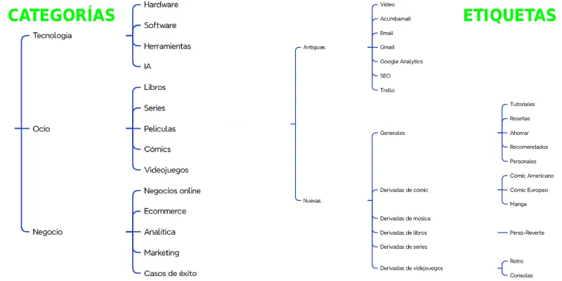
A full-blown recategorisation of taxonomies. And, for once — or maybe not — I didn’t apply SEO criteria to it. What for, if AI is going to eat most of it anyway?
This is about writing for myself and, if someone lands here and it resonates with them, having them subscribe to my newsletter or bookmark the website in Google.
We’ll talk about both of those points in a moment. But first I want to discuss the visual side.
Design changes
It’s funny how the brain and mood work.
When I redesigned my website in 2019 to turn it into a lead-generation and training-sales machine, I saw the future — in general — with optimism. I believed everything was going to get better and, as a result of that almost Aristotelian positive thinking, I looked for clarity in the design:
- Simple modules. Out went elements such as accordions or tabs.
- Light background.
- A single highlight colour (orange) combined with a greyscale palette.
- Short paragraphs.
- A typeface that put readability above everything else.
That was 2019. Now we are in 2026 and, seven years and one child later, I see things quite a bit darker: wars are breaking out in developed countries, something that seemed like a thing of the past; in Spain, political corruption has no end. Nor do tax rises and inflation. Malaga, which until now had been the city of my dreams, has changed so much in recent years, in so many ways, that it no longer is.
Not to mention, of course, that today’s internet — 3.0? 4.0? — has nothing to do with the one I truly enjoyed.
Addictive social networks, massive data collection, AI copying abuse without any kind of compensation for authors, and the “over-algorithmisation” of everything, which always recommends what we already like and therefore makes it hard to discover different things or points of view, all seem aberrant to me.
I’ve read various studies arguing that, objectively, we are living in the best era in history.
I, however, don’t see it that way.
And as a result of this slightly more hopeless view of the internet and life, the website redesign reflects it:
- Dark background.
- Riskier page compositions (parallax in posts, lots of visual content all at once on the homepage and category pages).
- A palette of several “acid” or “cyberpunk” colours applied across multiple areas.
- I kept the same typeface, but I’ve used it in uppercase in certain sections, which makes it a tiny bit harder to read in exchange for greater visual impact.
- I slightly reduced the letter spacing. In fact, I reduced it quite a bit more at first and, although it looked visually striking, it made reading much harder, so I toned it down.
In short, the exact opposite of the previous visual sobriety.
Starting with the main thing.
The brand and the logo
The first step was deciding the name of the publication.
Here I was quite clear that the word “digital” had to appear. Because it is very me. I’ve been moving around the digital world, in all its breadth, my whole life, since I first got into video games in the late eighties.
Then, looking at the topics I wanted to talk about and the goal of offering ideas to the reader, the word “culture” came naturally.
After the naming, always the hardest part of a brand, came the logo. At this point I was absolutely clear about two things from the start:
- That it was going to be text only.
- That green was going to replace the current corporate orange.
With those two conditions in mind, I opened Illustrator and started testing typefaces.
The underscore felt like an appropriate device, because it takes me back to MSDOS and the first operating systems, where it appeared to show where we were going to type the next character.
One final aspect to bear in mind is that I decided to keep my domain, even if only temporarily. That meant that anyone visiting yagogonzalez.com would find “Cultura Digital”. An inconsistency the logo had to solve at least in part.
Taking everything into account, this is the final result:
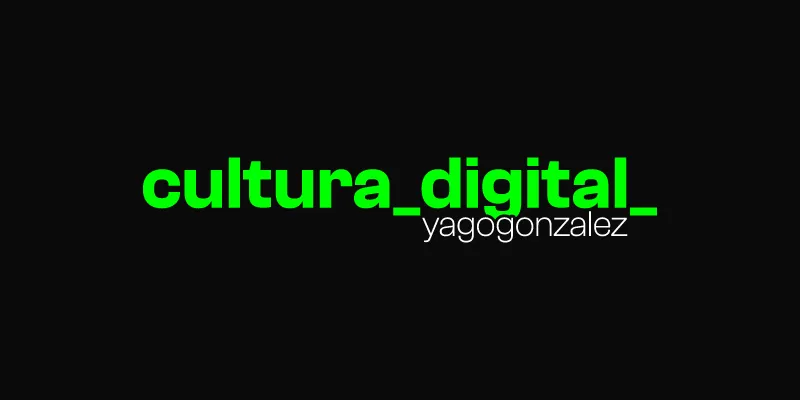
And I’m quite happy with it, because I think a good design is not the prettiest one, but the one that solves the difficulties. And this one does.
The colour palette
Although at first I thought about using only green and white on a black background across the whole website, as I added layers of content and functionality it started to feel too limited. Or rather, underused.
Yes, aesthetically it worked: it took you back to the early days of cybernetics, with those CRT screens with huge backs showing green text on a dark background.
But, perhaps because I was playing all the WipEout games to write an article and let myself be influenced by their aesthetic, I felt like switching from retrofuturism to acid and cyberpunk. So I expanded the colour range to:
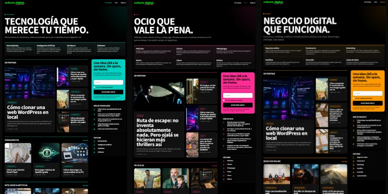
- Pure green (#00FF00). Which, well, strictly speaking is more “Lime”. It is the main colour and is used on the homepage, articles and tag pages.
- Fuchsia, for articles in the entertainment category and its subcategories.
- Cyan, for technology articles.
- Orange, the same one from the previous design, kept for business articles.
- Metallic blue, just in case I create another category in the future.
- Yellow, which was going to be for tags, although in the end I decided to keep the main green. At least for now.
With this distribution in mind, I first tried the most radical and extreme tones (all “pure” hexadecimal colours), but then I softened them a bit because I liked the look better. This is the final result:

Functionally, they have the editorial meaning I’ve explained. My goal with this is for each category to be a different “mini home” and to be clearly distinguished from the others by colour:
A silly thing?
Probably, but as I said before, I’ve built the website I wanted to build.
One more thing: if you look closely, the logo stays green in every case. That’s something I have considered changing more than once and, as soon as I finish this article, I’ll test it.
The visual structure of each page
Although a blog and a magazine may look similar at first glance, the truth is that there are quite a few differences once you scratch the surface. At least if we’re talking about personal blogs like mine was.
In those, the design is usually more functional, more focused on the reading itself, without many flourishes.
A magazine is not like that. A magazine has a more complex design, probably because of its broader thematic range, the involvement of several writers and the incentive to keep the user on the website for as long as possible.
The thing is, when I decided to change my website, I immersed myself in the newspapers and magazines I usually read, as well as other global leaders.
With that jumble of ideas, the website concept I wanted and the features I wanted to add — more on that in the next point — I explored different possibilities.
I started first with the article template design.
The article template
Here I wanted something striking, because while for a tutorial the first impression is not at all relevant — within minimum standards of design and UX, of course — for entertainment articles it does matter.
That’s why I now open with a Hero section with parallax scrolling, with a huge background image (1920x1080px) that looks pretty spectacular on PC, since it fills the screen no matter what monitor you use (from 1024px wide to a 4K one).
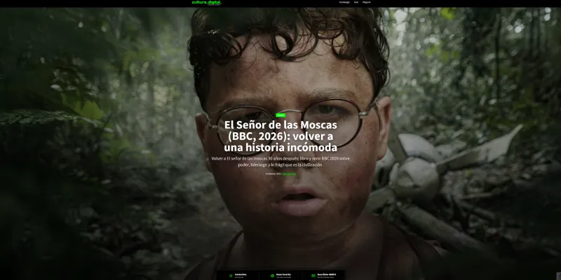
And yes, I’m talking about PC. Because in my case, most of my readers come from these devices and not from mobile, most likely because of the type of articles I had been publishing until now.
Next I added a right-hand sidebar, with a newsletter subscription module, related articles and my recommendations.
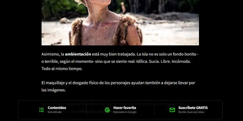
The goal was to increase page views, but after pushing it to production and keeping it there for a week, the metrics actually dropped, so I undid the change and moved the related and recommended articles below the post (with their corresponding facelift adapted to the new look and feel) and created a fixed lower bar that follows the reader as they scroll, with three features:
- Newsletter subscription.
- Bookmark my website in Google.
- A table of contents to navigate the article, since they tend to be quite long.
You can see it here:
Another change that took me some time was redesigning the style of the headings in the articles.
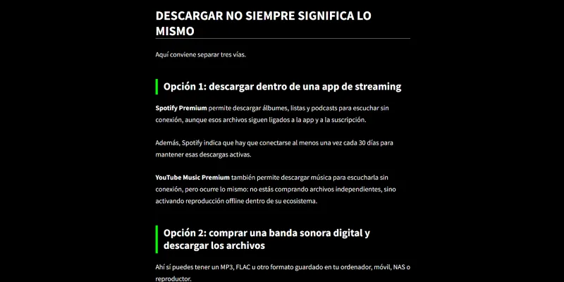
I use a lot of H2s and H3s and, sometimes (as in this article), I can go as far as H5s. So I needed them to differ visually by more than just font size.
I spent quite a lot of time testing different styles until I found one I was happy with. Here, the H2s, which are general sections, separate the content very well with their white bottom border, and the H3s stand out visually thanks to the green side border:
The homepage
After redesigning the article template, it was the homepage’s turn.
This was important, because it was going to define all the other templates (category and tag listings).
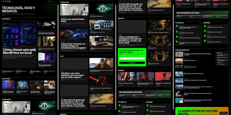
In this sense, the structure was clear: I wanted a modular homepage where each category and some tags had their own space.
I was also clear that I didn’t want all the modules to be identical, but that there should be certain structural changesthat broke the rhythm.
Besides, I wanted it to be very dynamic and to update constantly, given the amount of content I intend to create. If you want a user to visit your website every day, they can’t always see a static homepage.
And, of course, I wanted to keep the futuristic cyberpunk vibe, both in the colours and in stripping away anything accessory. In other words: text and image take centre stage, with no icons making the whole thing friendlier.
This was the result:
The main category pages
Once I had the homepage, the main category design followed the same line, changing the green for the corresponding colour.
Although the design is not exactly the same, it does follow the same lines, adding a top module with rectangles linking to each subcategory, clearly showing what you can expect inside:
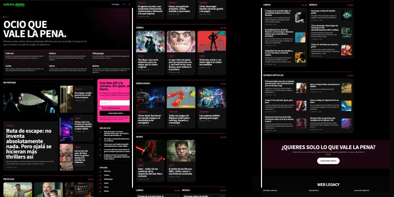
In this sense, I liked how the responsive version turned out, because I transformed this module into a carouselso the first image could be seen without needing to scroll.
Also, the sidebar is fixed and follows the user throughout the entire scroll, so the newsletter subscription form stays very prominent and present.
Subcategories and tags
Given their lower hierarchical importance, I wanted to simplify their design.
Here there are no longer multiple modules, only two, and not always:
- A module with four featured articles that appears only if the subcategory or tag has more than 6 articles.
- A module with the latest 15 articles, accompanied by a sidebar.
Simple and functional:
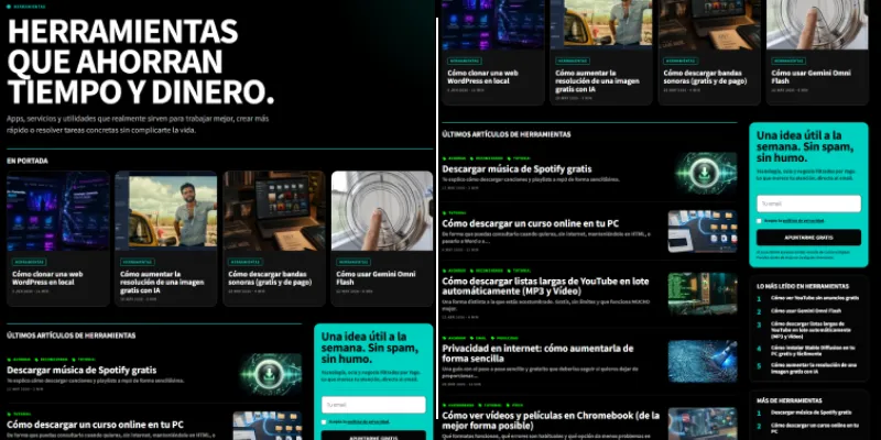
As you can see, the links to tags have stayed green. This is for editorial consistency, since that is the colour tags currently show.
Design changes to general elements
The menu changed quite a bit: first because I removed the JS functionality that triggered an opening animation and that I didn’t like on mobile.
Second, because I made the hamburger icon much larger and cleaner, also on mobile.
Third, because I changed the colour of each link on hover, tying it to each category colour (cyan, fuchsia and orange).
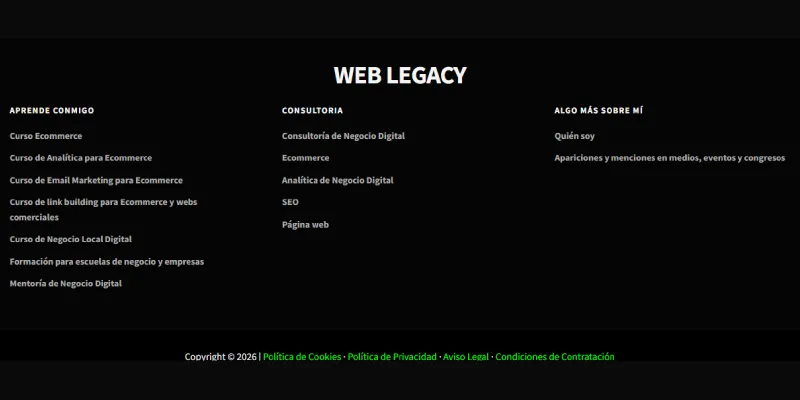
I also changed the footer, leaving all the pages from the original corporate site there because they have some positioning that brings me traffic, as well as the odd strong link:
Design discards
There are three points I’ll probably implement in the future but, for now, have been left out.
The first is the use of yellow on tags:
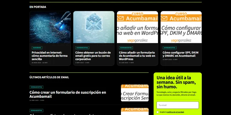
I tested it and it worked well, but I thought it was already too much change, although I’m not entirely sure and I may change it together with the next point.
Which is using the logo in multiple colours, depending on the section of the website you are in. Something like this:
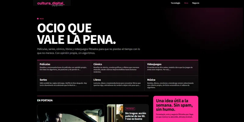
I like it, and although it goes hand in hand with the previous point and I’m clear that it’s “far too uncorporate”, the truth is that I like the result.
The final design point I discarded from the start was reserving spaces to add advertising.
It’s a monetisation idea I have in mind, but until I manage to multiply current traffic by 10, I’m not even going to consider it.
Increasing functionality
The old website was a corporate site and was prepared for two specific things:
- Capturing leads.
- Selling training.
The needs of the new one are quite different.
To begin with, because of the content management on the homepage and category pages. It’s no longer just about posts appearing in chronological order; it has to be manageable manually so certain posts can appear where I prefer, based on strategic criteria.
I had to develop this part using a little development work and the plugin ACF (Advanced Custom Fields), a super useful one you shouldn’t lose sight of.
Another part I had to develop with the same plugin is all the copy for the homepage, categories, subcategories and tags.
Yes, I could have put it in the code and nothing would have happened… if I didn’t want to translate the website into several languages. The way I’ve done it, these texts are managed from the WordPress admin in each language and in a simple way.
Of course, all the side modules for related and recommended posts are new. As is the impossibility of a post appearing more than once on the homepage and category pages. In other words, even if a post could logically appear in two modules (because it has two parent categories, which can happen), it doesn’t, thanks to a bit of code.
I’ve also added certain things that I think may be useful to the reader, such as the estimated reading time for each post and the category it belongs to (and a link so they can access it) on listing pages, and the lower bar I mentioned earlier in the posts.
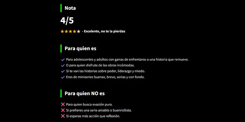
I have also added, in posts, specific sections for reviews:
- Score (my rating of the film, game, book or series).
- Sections Who it is for and Who it is NOT for, where I summarise the kind of person who will or won’t enjoy the work.
- A fact sheet with the relevant details.
But despite all these changes, I’m still not done. In fact, I’d say the biggest part is still left.
Pending points
Yes, even though it’s already live, I still have several things to do, including one fairly substantial one: the following.
Semi-automatic translation plugin
One of the main features I want to add to the website is semi-automatic translation of each post, using AI.
And doing it properly.
Because it’s not just about taking the text, giving it to Claude and having it put it into English.
Not at all. The idea is for everything to be translated correctly:
- The textual content of the post.
- Internal links.
- Image alt text, including the featured image.
- SEO attributes (title, URL, description).
- FAQs and other custom fields.
- The automatically generated table of contents with its anchors.
- The automatically generated schema.
- And of course with its hreflang and its translated categories and tags.
For this, my idea is to set up a process with manual and automatic steps, executed after publishing the article in Spanish, so that all the points above are perfectly translated.
The idea is to multiply the number of URLs by five, because I think the content can be just as interesting for a Spaniard as for a Portuguese or French reader.
The thing is, building the system I want — a plugin that complements Polylang — is going to take quite a while until it’s really, really polished.
And then I’ll have to see both the load it adds to publishing each article and the time I can devote to translating existing articles.
This is a proper can of worms.
Analytics
Although all the lower bar functionality is already tagged, I still need to track all clicks in each module and link on the homepage and category pages.
This is relatively quick to do, especially if you use ChatGPT both for the analytics plan and for executing changes in GTM. In half a morning I’ll have everything more than ready.
Colours
As I’m writing this article, it’s becoming clearer to me that I’m going to change the colour of tag pages to yellow and that the logo colour will be dynamic depending on the section of the website you are in.
Copy
I wrote it all in a rush just to launch, so it clearly deserves a review. Probably when I start the translation will be a good time.
Monetisation
This is the only thing my partner (surprisingly) asks me about.
She’s not so sure about spending so much time on something that doesn’t pay for Enrique’s nappies, but for now I’m only going to add some affiliate links.
We’ll see later.
In the short term, monetising is not the goal; growing the project comes first.
Next steps
Apart from everything mentioned in the previous point, which is what I’ll close in the short term, there are things I don’t consider essential and that weren’t on the roadmap, but that I think I should do.
SEO
It’s not a priority right now. There is a good base and I know the rest will come, but even so I’ll have to:
– Test performance of the new homepage, category and tag designs.
– Run Screaming Frog across the entire website to detect possible errors related to the change.
– Analyse and decide whether I redirect the old corporate pages to current category or post URLs to preserve SEO, since some of the corporate pages have strong backlinks.
– Redirect certain pages to others because of the website recategorisation .
Detailed review
It is more than likely that there are sections of the website I’ll need to review more carefully, such as certain plugins that add code, or the whole Yoast configuration at project data level.
As with SEO, I’m in no hurry. Right now, the important thing is multilingual. When I’m done with that, we’ll talk.
Semantic search
It wasn’t something I had on the roadmap, but my friend Rafa Casas mentioned it to me. He is one of the best copywriters in this country and is very up to speed on all things AI, so I think I’ll give it some thought to see what I can include and how.
And with that, version 1.0 of Cultura Digital would be definitively closed.
Conclusions
Believe it or not, this is the summary version of everything the website change has meant for me.
And although I executed the heavy work itself in a day and a half thanks to Codex, the truth is that the planning had been developing for months in my head.
Of everything I’ve told you, what I want you to take away is that it is a publication that aims to give you ideas so you can save time and money in your personal and professional life and, thanks to that, live better.
That is the ultimate goal of all this.
Although the truth is that I had a great time shaping it. I’ve always said that one of the things I’ve enjoyed most in all my work has been making websites, and once again, that has become clear to me.
I hope that if you’ve made it this far, it has served as an idea or inspiration and, if you have any questions about the process, leave a comment below and I’ll answer it.
And if it isn’t a question and you just want to give your opinion for or against some part of the project, or the whole thing, I invite you to do that too. I’ll really appreciate it.
Frequently asked questions
What is Cultura Digital?
Cultura Digital is an online magazine about technology, entertainment and business.
What topics does Cultura Digital cover?
Tutorials, AI, gadgets, films, series, comics, video games, productivity, saving, investment and digital business.
Why was Cultura Digital born?
It was born as an evolution of the old blog, to write more freely about digital and cultural topics.
Does Cultura Digital replace the old blog?
Yes, it expands it. The business content remains, but now it lives alongside technology and entertainment.
What is the goal of Cultura Digital?
To offer useful ideas for saving time, discovering tools, choosing better and living better.
Why does it have a dark, cyberpunk design?
Because it seeks a more visual, editorial and personal identity, far from the previous corporate look.
What do the website colours mean?
Green is the main brand colour; cyan is technology, fuchsia is entertainment and orange is business.
Will Cultura Digital use artificial intelligence?
Yes, both to speed up development and to create new features and translations.
Will it be available in other languages?
The idea is to translate the website into several languages with a semi-automatic system supported by AI.
Is Cultura Digital trying to monetise from the start?
No. First it aims to grow, publish content and validate the project.
How often will new content be published?
The goal is to publish at least one article a day for a year.
What makes Cultura Digital different from a corporate website?
It is not designed only to sell services, but to publish, recommend and discover useful ideas.

Leave a Reply