
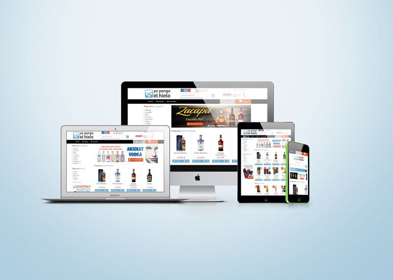
Yopongoelhielo.com is the premium online drinks store that we have just launched. For the website design, we focused on following the “Metro” style of flat design, because it allowed us to create a clear, simple look & feel, with a UI aimed at making the UX as pleasant as possible. Obviously, it is a responsive website, both server-side and client-side.
We were clear that the background would be white. For the logo and brand identity, we wanted a primary colour tied to the naming, which obviously ended up being blue, and which also had to combine properly with black and the grayscale. As a secondary colour, we chose an orange very close to the complementary colour, used to highlight certain details on the site (price, shopping cart, claims…).
Another thing we paid a lot of attention to was the quality of the images. We were very aware that, if we wanted to sell premium products, the entire visual side had to be very carefully handled. The truth is that we were also satisfied with this point: large images, optimised as much as possible without losing quality.
What do you think? What would you change?
Link to the online drinks and spirits store.
If you want more information about the project, you can find it here.

Leave a Reply